
Brand Kit
The brand, written down once.
Logos, favicons, share image, colours, type, and corner radius in one place — then exported as CSS, JSON, or Tailwind config so your site uses the same values the workspace does.
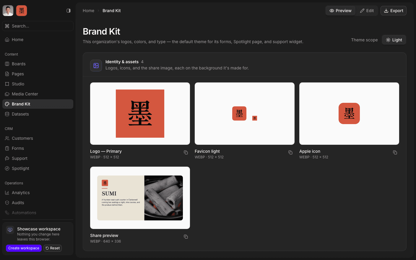
Press play to run the real interface right here — made-up data, in your browser, and nothing you do in it leaves the tab.
A brand guide a machine can read.
A PDF brand guide tells a person what the hex code is. This one tells the software. Define the colours, the fonts, the radius scale, and the identity images once, and everything downstream picks them up: a new form is styled before anyone opens the Design tab, a Studio template starts on-brand, a Spotlight page matches the site it links to.
Six fixed image slots — primary logo, alternative logo, light and dark favicons, apple icon, and share image — plus as many custom named images as the brand needs. Each slot takes either a Media Center asset or a Studio frame, and a frame-backed slot stays in sync when the design changes.
Declare whether the brand is themed light, dark, or both, and the kit only asks for the values that mode actually needs. Then export the whole thing as CSS custom properties, JSON, or a Tailwind config, and use it outside SharpOS too.
Inside Brand Kit
Define the colours
Light and dark values, as far as the brand's scope goes.
Set the type and radius
Heading and body faces, plus the corner-radius scale.
Fill the identity slots
Logos, favicons, apple icon, and the share image.
Declare the theme scope
Light, dark, or both — the kit asks only for what applies.
Export the tokens
CSS custom properties, JSON, or a Tailwind config.
Keep brand documents
Markdown docs for tone, usage, and the rules behind the values.
Open the kit.
Book a 30-minute call. We'll go through what's working, what isn't, and what the first move should be. If we're not the right fit, we'll say so on the call.